Project: Going Virtual

It can be difficult for a small charity to take on the challenge of creating a website. Working with Helium was a wonderful learning experience, and we are thrilled with the overall look, feel, and versatility of our new and improved site! Helium worked with us every step of the way with design, functionality, and accessibility to ensure that we would be left with an informative and user-friendly site. Helium also provided us with training to ensure that we could continue to edit and manage the site moving forward, and is always there for us if wee need assistance.
Thank you to the Helium team!
Brittany, Youth Without Shelter
The Challenge
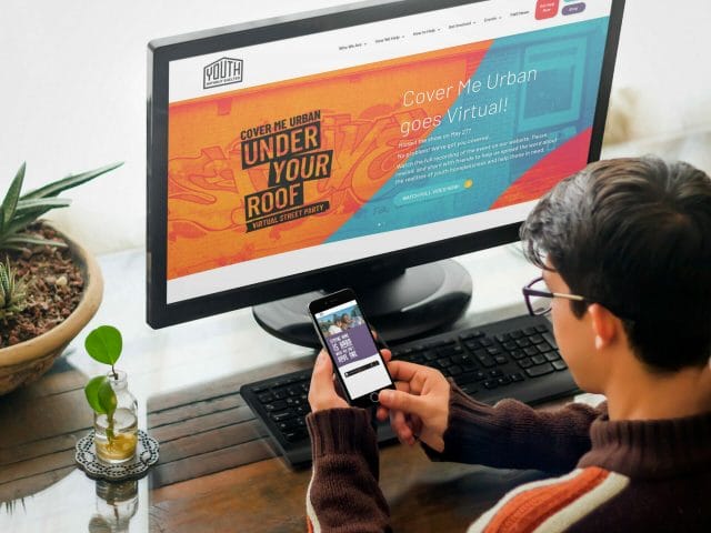
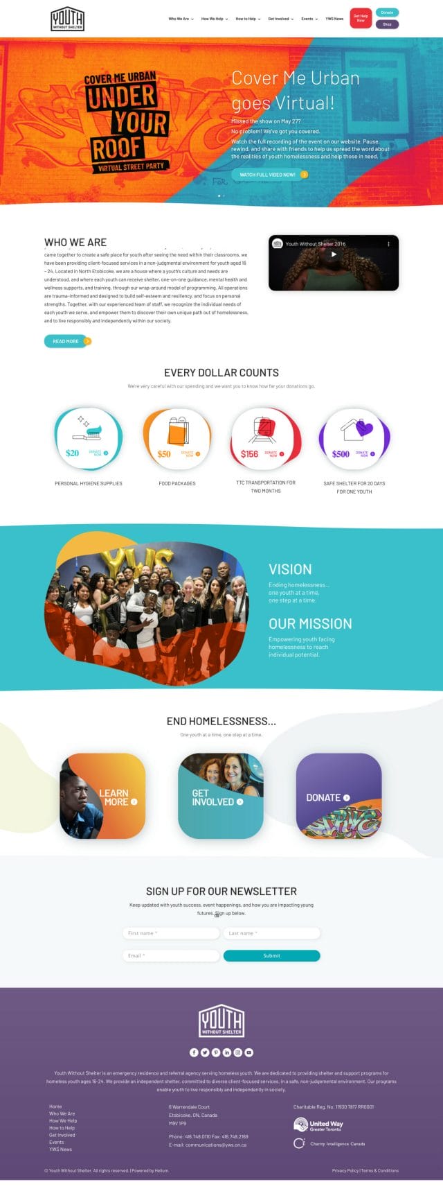
Youth Without Shelter needed a user-friendly website to match their new colourful brand identity. Their site needed to be easily accessible for youth to find help anytime and on any device.
The Solution
We built out a website that was simple to edit for the internal team with built-in visual templates. The new website was designed to match the brand update while keeping it mobile-responsive. Lastly, the get help page got really big over-haul from being a document with hard-to-find resources to the new easy-to-read grid we created.
Design Elements

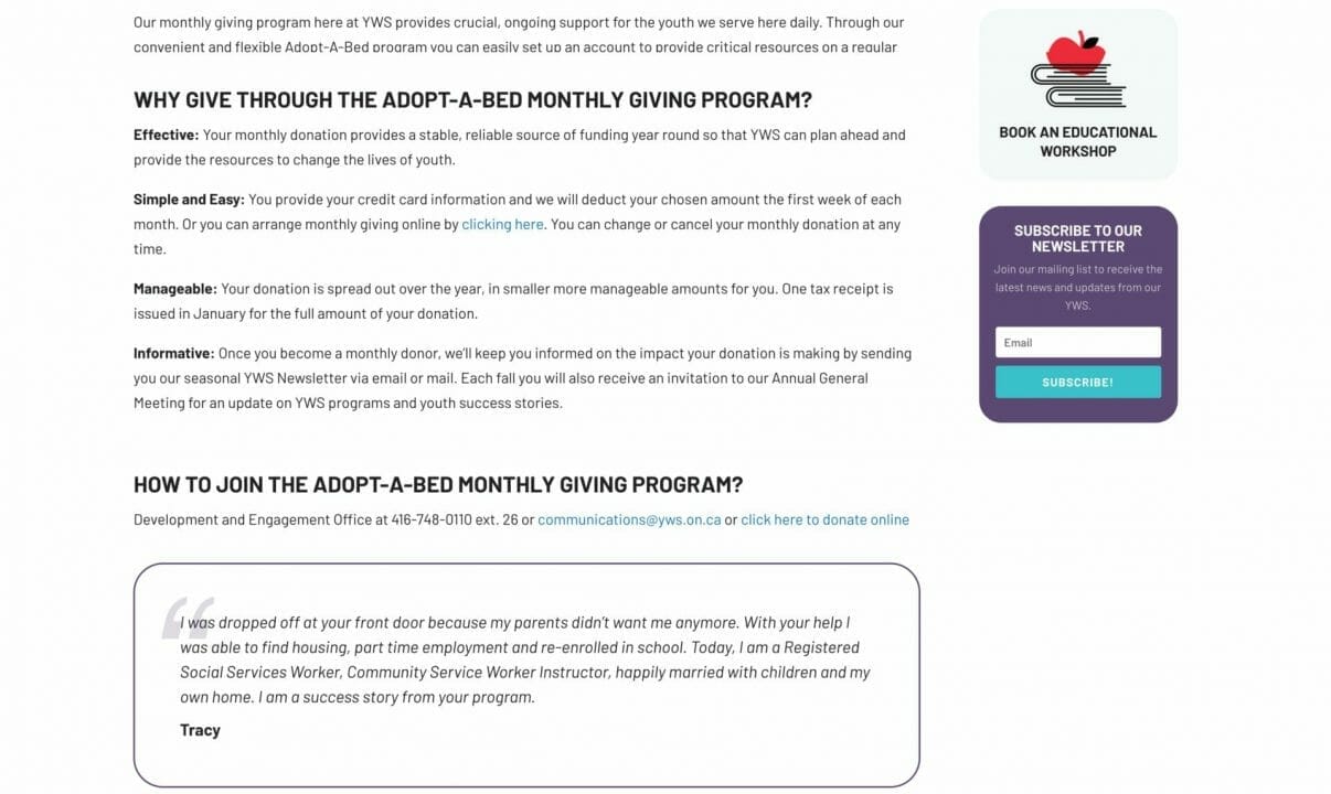
Monthly Giving

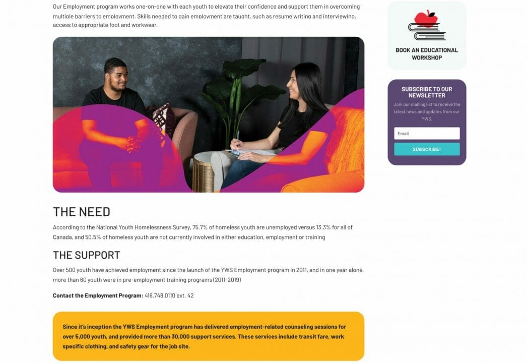
Youth Employment Program
